
Reframing The
Khaki Pant
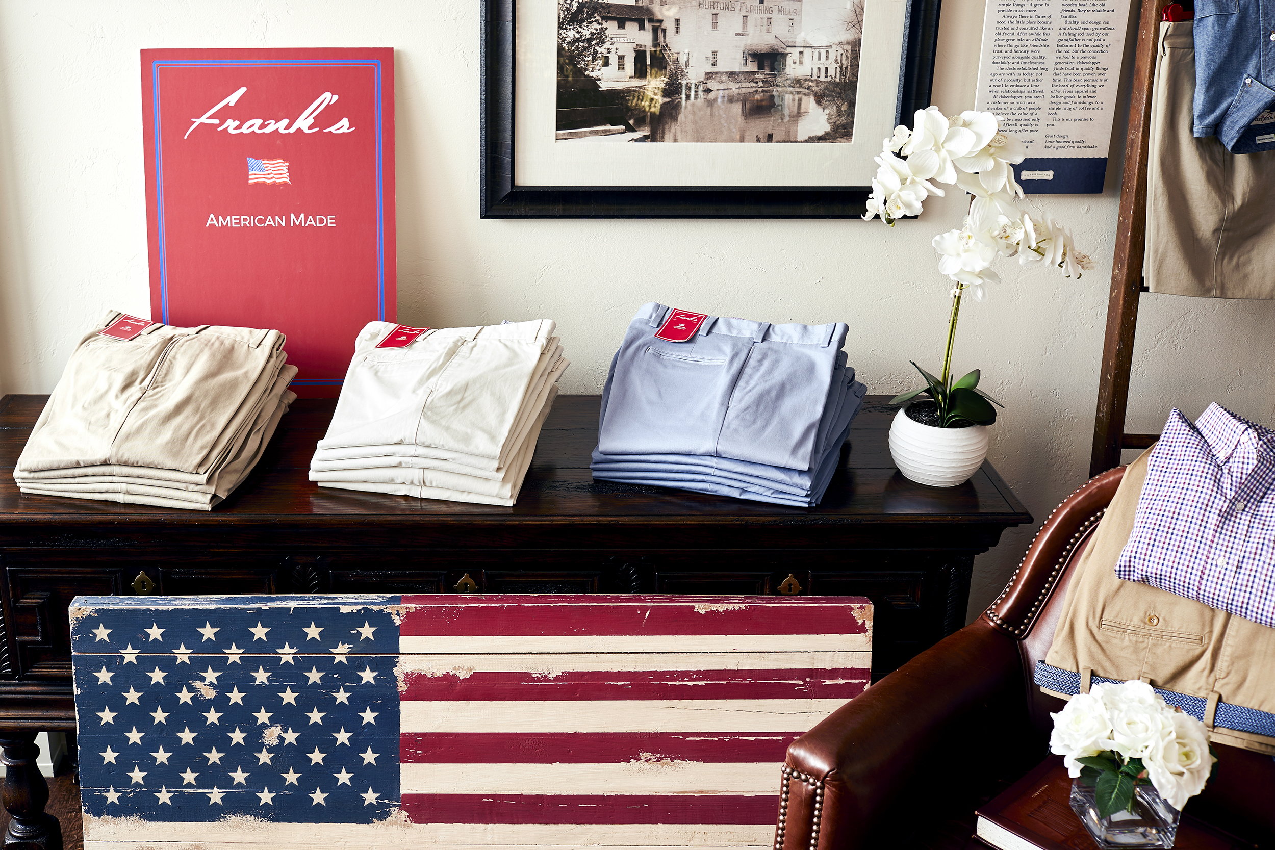
The cotton Khaki pant. Traditional. Understandable. Not fussy. But also boring and expected. A commodity with no tangible differentiation. The market flooded with imports available at every price point.
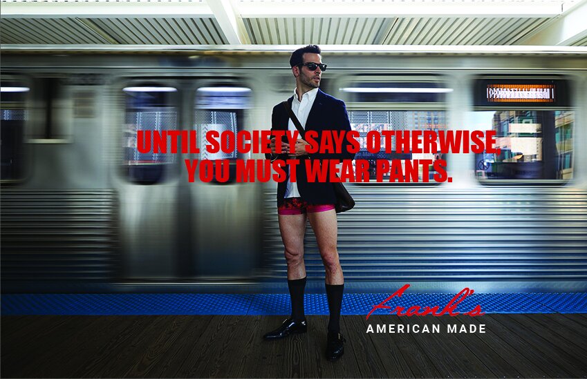
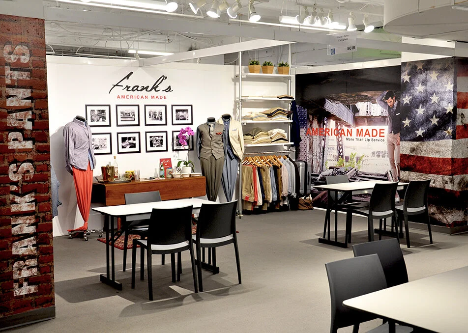
Frank’s needed to be bold. To change the perception of the Khaki pant among fashionable men, Frank’s wanted to change how this audience viewed the product. This wasn’t their Dad’s chinos. This was a premium, American-made interpretation of a classic that fits and performs for the modern man.
To remind men to start paying attention to their pants, we took the pants off. While the entire campaign wasn’t as bodacious, our intent with the art direction and photography was to be unexpected while talking about a product that was so familiar.
“We wanted to disrupt how consumers viewed traditional khaki pants. We needed someone who understood us, could relate to our business and was just as bold as us. Jollybrowne hit the mark.”






Softening
Business
Formality
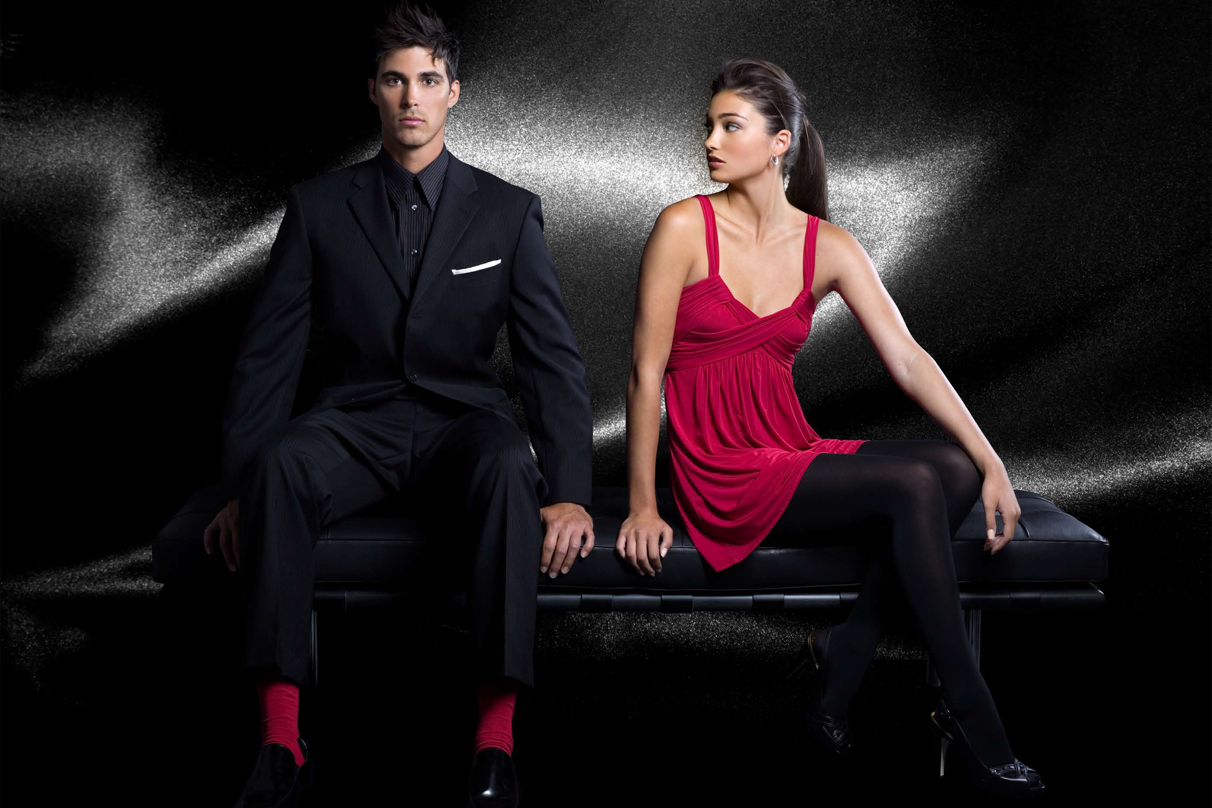
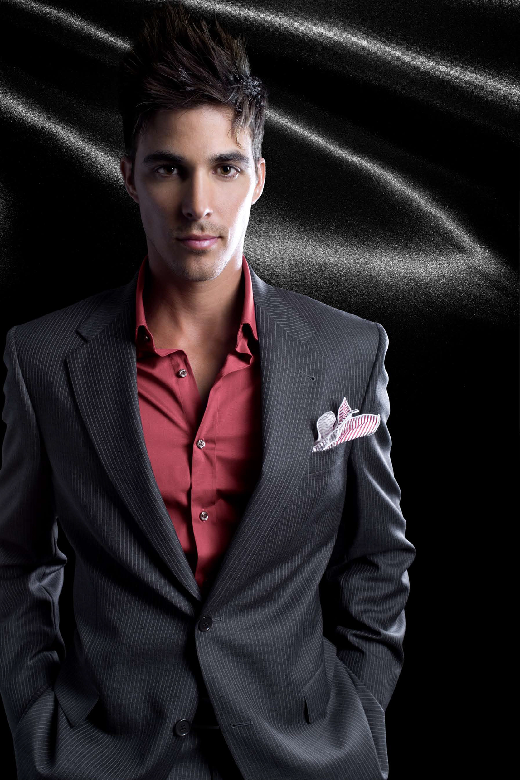
Hart Schaffner Marx was forever the quintessential suit label for men who aspired for the corner office. Then suddenly the office dress code changed requiring Hart Schaffner Marx’s messaging to evolve yet still be true to its heritage.
As the brand embarked on a full repositioning, it required a way to stretch its marketing resources while maintaining control over its brand messaging. It needed to build a deep cache of content for use domestically and by its licensed partners worldwide.
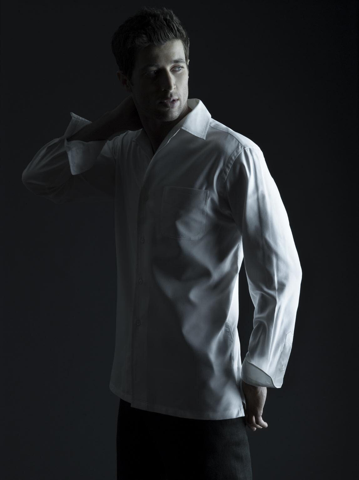
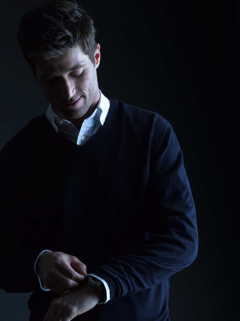
Our idea for simple shots with dramatic lighting captured the brand’s emotion, put its new casual look on center stage without distractions and allowed us to shoot in a single location. Without having to worry about the logistics of a photo shoot, we were able to focus on producing a large amount of content in a very short time saving the client thousands of dollars.
“Jollybrowne’s biggest asset is their ability to think about the business and creative processes with a great understanding for the various needs of an enterprise — creative appeal, clear messaging, value proposition, and marketing ROI. Jollybrowne have been an excellent partner in our repositioning.”




Seeing
Is
Believing
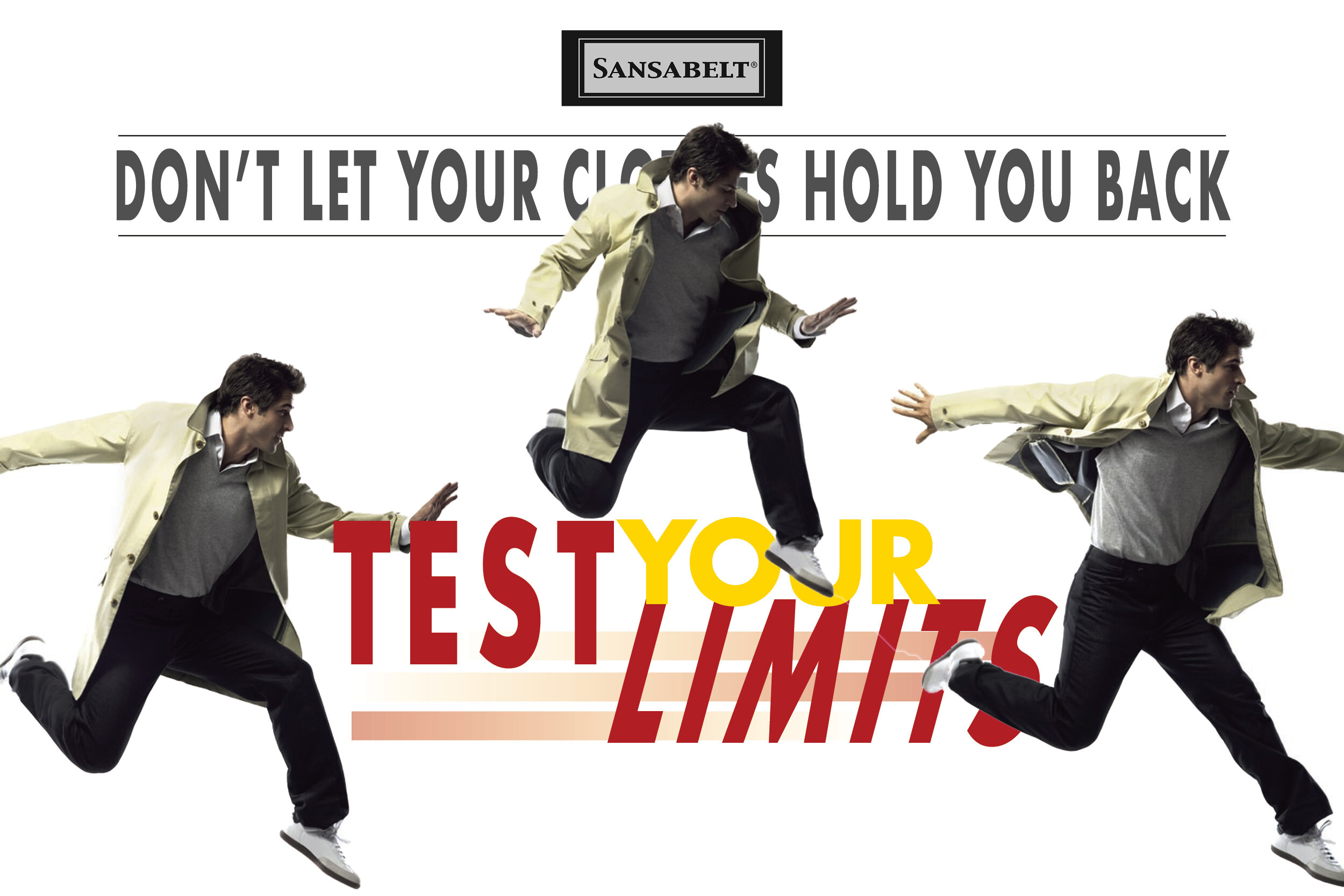
In its heyday, Sansabelt was the premier luxury pant. One in every five pants sold in this country were Sansabelt. It’s unique waistband technology, five-pocket styling and ultra-stretch fabric made it America’s original performance pant. Even Johnny Carson endorsed it.
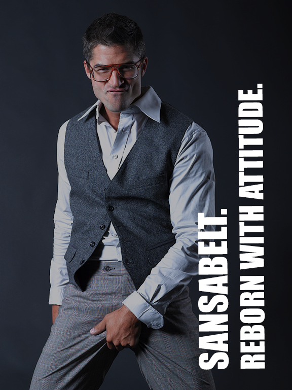
A half century later, Sansabelt was nearly extinct in the U.S. market. However outside the country, it was still a popular brand despite needing a serious brand rebirth. It required messaging that communicated the product’s key benefits — comfort and performance, to its most important demographic (over 50) while starting to appeal to a younger audience.
We wanted to communicate a carefree, confident attitude that transcended age. Our creative featured the guts of the pant as much as it had the pant in full action. The idea was to communicate performance to a younger consumer and comfort (but you still got it) to a more mature man.
“We licensed Sansabelt for its technology. We required to tell the story in an exciting and simple way. This photography was on-brand and reinforced our positioning perfectly.”




IT’s
all ‘bout
good product
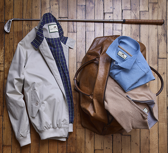
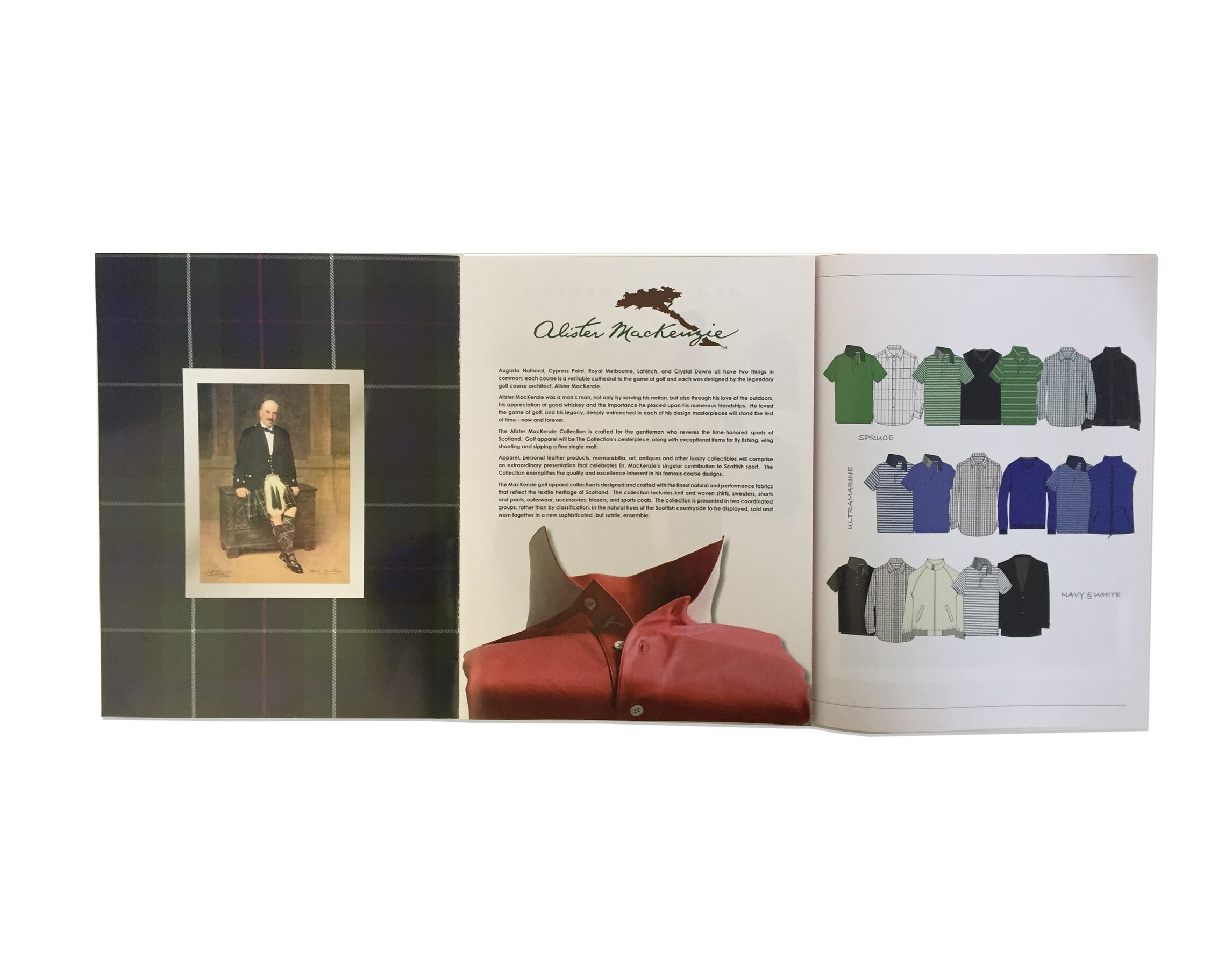
Alister MacKenzie is a member of the World Golf Hall Of Fame. Three of his 50 course designs are in the world’s top 10: Augusta National Golf Club, Cypress Point Club and Royal Melbourne in Australia. The name is synonymous with excellence.
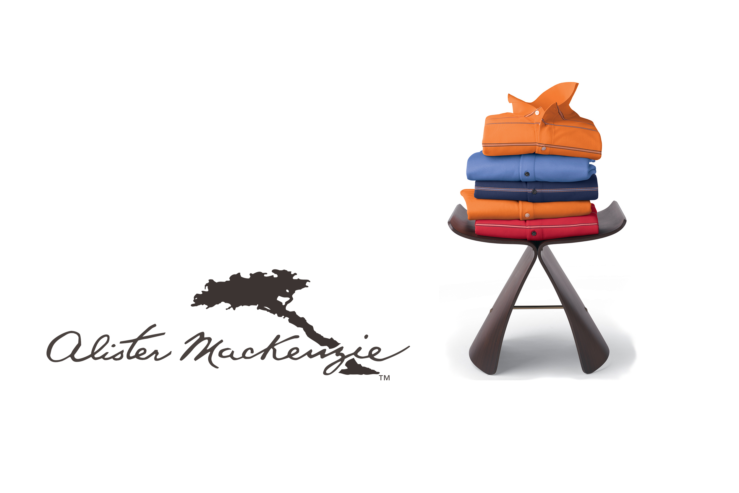
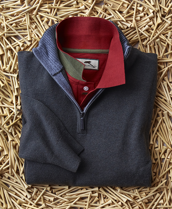
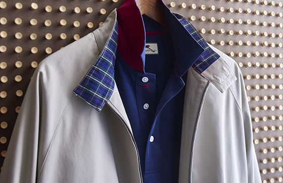
Thus no surprise that when the brand launched in 2016, it was positioned as a natural alternative to shirts made from synthetic fabrics. Alister MacKenzie had found a way to harass the natural performance features of cotton that allowed it to perform against the best synthetics. Our challenge was to bring out those luxurious, tactile qualities with evocative photography.
Using dramatic lighting and contours, we made product the hero. Our goal was to bring out the rich, lofty suppleness of Alister MacKenzie’s shirts and sweaters. The content supported an integrated trade marketing campaign to introduce the brand to buyers at the PGA Merchandise Show and the Chicago Collective.
“Jollybrowne understood our priorities and resources. They were caring and creative, and did a fantastic job.”





Interpreting
Iconic Style
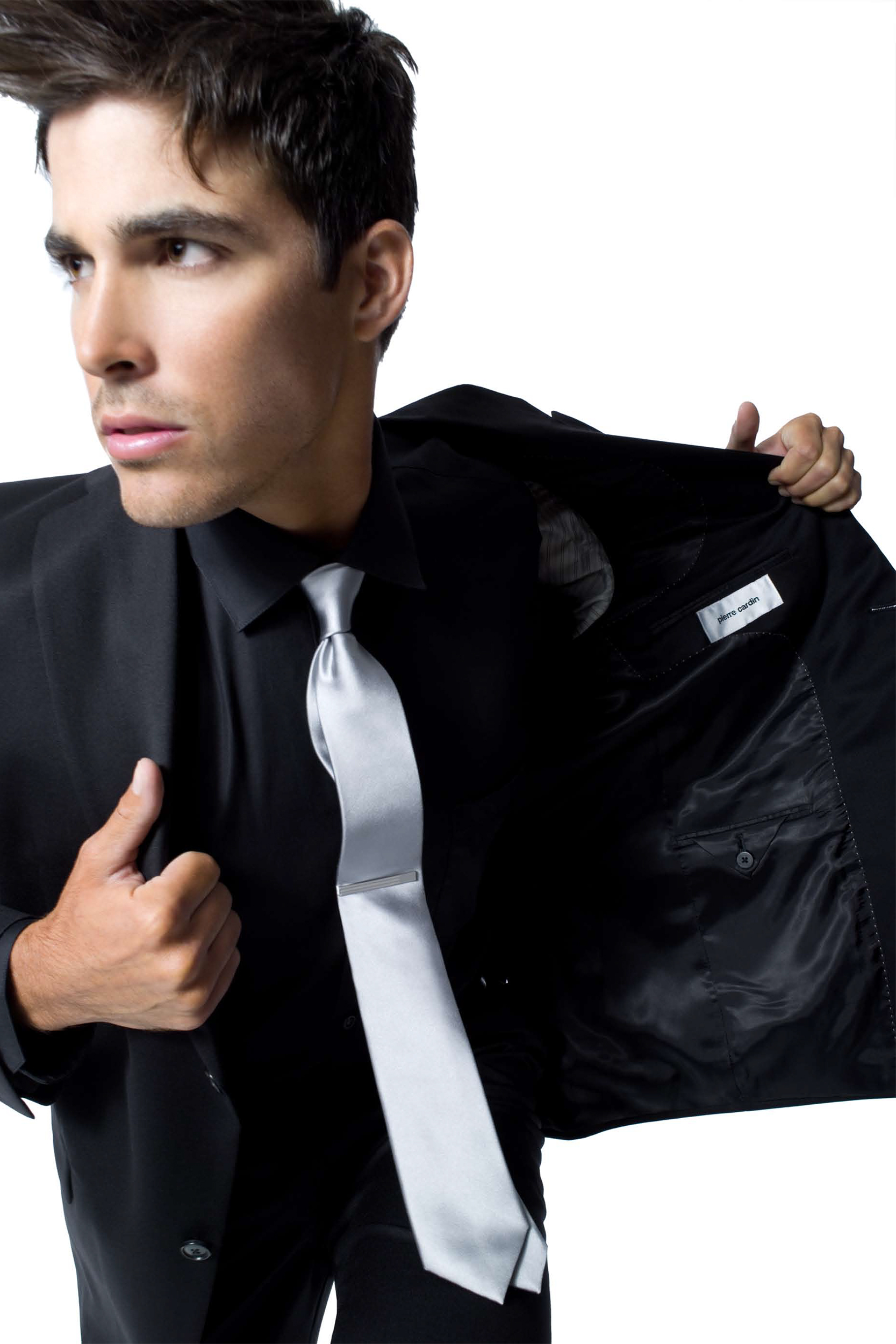
Pierre Cardin may be the most recognizable name in fashion globally. His signature logo is emblazoned on tens of thousands of products.
While the name still has a high level of awareness and the brand messaging from Paris remains aspirational, Pierre Cardin’s couture has been adapted to fit local markets without losing its distinctive style. This is our translation for the American mass market.
Pierre Cardin’s look has always had a certain energy. Clean lines. A juxtaposition of bold colors. A warm sensualness can be found within its modernity. We added some attitude through lighting and cropping that leaves just enough to the imagination
“We are pleased with this work. Jollybrowne have captured the spirit of Pierre Cardin so it is understandable for the North and South American markets. Congratulations on a job well done.”
